Probing the creative mind #6 Chris Harrison
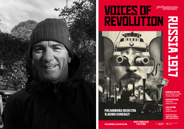
The sixth in a series of posts hoovering up the juicy bits from the minds of creative people. Copywriters, Art Directors, Creative Directors, Graphic Designers, Photographers, Illustrators, they’re an odd, mysterious bunch – or are they? Introducing Chris Harrison, Creative Director and Graphic Designer.
So Chris, tell me about where you work and what it is you do.
I work in Brighton at the rather imaginatively named ‘Harrison Agency’. We’re a branding and design agency. On paper I’m the Creative Director, but you can also add to that credit control, project manager, stationery monitor and IT person too. I try and bring a little creativity to all the roles!
What first got you into a creative career?
When I was a kid, I found myself staring at a tin of Quality Street one day and thinking I’d quite like to be the person who puts the pictures on the outside. Fast forward to 1991 after graduating from art school, I landed my first job at Saatchi & Saatchi, working on branding and packaging projects. I never did work on the Quality Street brand – the closest I got was working on the doomed rival to the Cadbury’s Creme Egg, the ‘Mars Egg’, with ‘Marv the Rapping Rabbit’ as its mascot. No wonder it bombed!
Bizarrely, my first work placement was at Saatchi & Saatchi, working on Quality Street. How did you land your first job with them?
After art college I set myself up with a series of work placements. At each agency I’d ask all of the senior designers to write down the names of their friends in other agencies. Armed with their names I’d work my way through the list, and rather cheekily say “so and so said I should call you, he/she said you’d probably be interested to see my portfolio!” It worked. One name on one of the lists was a Creative Director at Saatchi & Saatchi Design. I called up using my line, got an interview and then got a job. It was a case of right place, right time. They’d been reshuffling and there was space at the bottom – I slotted in and stayed for 6 years.
What’s your go-to starting point to get the creative process moving?
Panic. Followed by an acute sense of “Who do I think I am to be taking on such a challenge?”. Then I’ll start to read something, anything. I read reports, interviews, reviews, anything to get the inspiration started. When I look back at the projects that were the most effective, all of them started with an idea that sprang out of something I’d read.
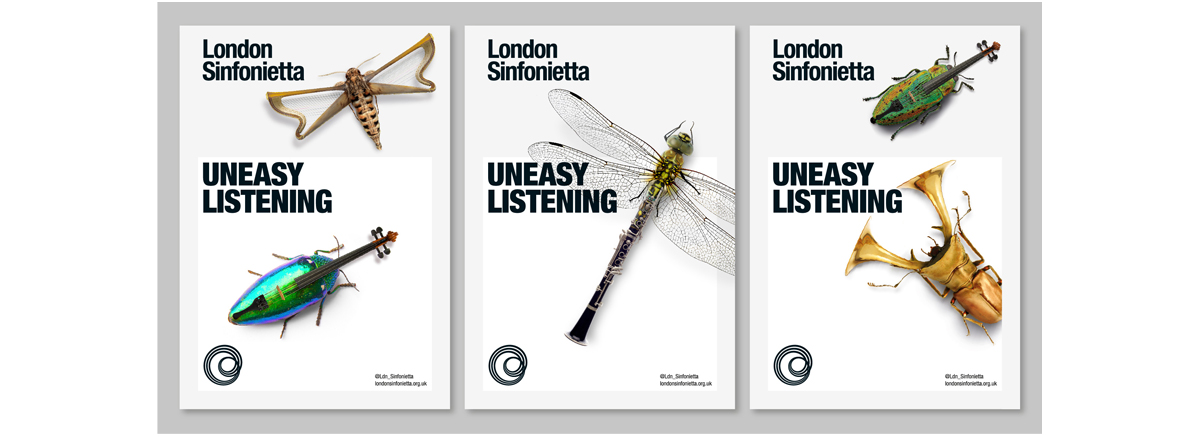
A few years ago I did a project for London Sinfonietta – a campaign for their upcoming season of concerts. I started by reading an Arts Council report that said that London Sinfonietta were “hard to love”. To me that sounded like a negative just waiting to be turned into a positive. Long story short, we came up with the idea of “uneasy listening” for their campaign, based on the idea that London Sinfonietta aren’t for everyone, but for those that “get it” it’s a thrilling experience. To support the ideas we morphed exotic bugs with musical instruments.
Who have you worked with along the way who has influenced you?
My first boss, Georgina Urwin, at Saatchi & Saatchi was a huge influence. She had a way of cutting straight to the heart of a brief and verbalising really inventive solutions. She taught me to visualise ideas in my head before committing anything to paper. She was bold with her thoughts and her design aesthetic too, and I like to think I’ve carried that on in my own work.
What ingredients make up the ideal client?
After an enormous budget and complete creative freedom(!), I’d say a good level of open communication, trust, and a shared creative vision. Trust being number one.
Tell me one thing you’ve learned that you would like to pass on to other creatives.
After 26 odd years in the business I still feel like I’m learning myself! I was thinking the other day that one important thing that has taken me a long time to learn is to chill the fuck out about client work – all aspects of it. Winning it, keeping it, doing good work for them, pleasing them, disappointing them, etc etc. I carried a lot of anxiety about “getting it wrong” in the early days of having my own business. Since I’ve lightened up I’ve enjoyed it more and done better work. So maybe the advice would be: “don’t be too hard on yourself”.
What three pieces of work do you wish were in your portfolio?
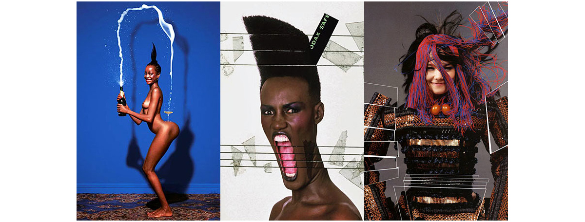
Damn, that’s tricky! I love the work of Jean Paul Goude, a French designer, art director, illustrator and photographer. His work is a lovely mix of disciplines and then applied to print, moving image and environments.
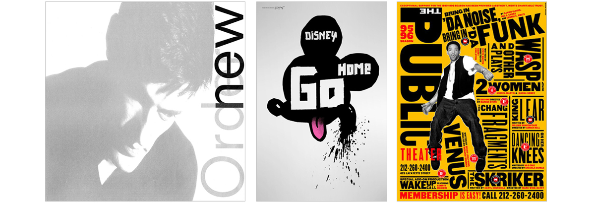
A more tangible answer might be anything by Peter Savile (maybe New Order’s ‘Low Life’ album artwork?). I also love James Victore, a US designer, illustrator and artist – maybe I’d choose one of his ‘Disney Go Home’ protest posters. And also Paula Scher, a fantastic graphic designer who’s also a partner at Pentagram NY. I’d put all of her work in my portfolio, but if I had to choose one project, it’d be the work she did for the Public Theatre in NY. Paula Scher is a genius.
What’s your favourite piece of work from your portfolio?
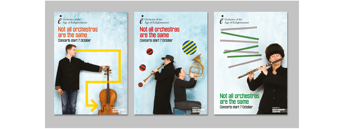
Our 2010 season campaign for the Orchestra of the Age of Enlightenment. The idea came from a self portrait photographic project I was playing with that used colourful gaffer tape (that sounds narcissistic, but it was before ‘selfies’ had a bad name). Anyway, I showed the client my self portraits and pitched the idea of shooting the orchestra members in the same way. They loved the idea and it became a really successful campaign that went viral (again, this was before brands tried to force campaigns to go viral – ours happened organically). It earned the orchestra tens of thousands of pounds in free media. For me, it was a perfect mix of three things I love: graphic art, photography and whimsical ideas.
What one thing would make your job easier or better?
I think more time away from screens. Technology has helped the industry to move on in lots of great ways, but I’m not sure that staring at a screen is the best place to do creative work. In fact, I’m certain it isn’t. I try and turn it off or turn away as much as I can. We’ve tweaked our working hours, too. Inspired by the Swedes, we now work a six hour day: 9.30–4.30, giving us a little less time at our screens and a little more time living our lives, and it’s had a very positive impact. We’re just as productive as we’ve always been, if not more so.
If you weren’t a Graphic Designer, what would you be?
A photographer and a member of Magnum. If you put me on the spot I’d like to be Elliot Erwitt or Harry Gruyeart, please. Either will do!
Thanks Chris. It’s really refreshing to hear that you’re addressing the work/life balance thing rather than just paying lip service to it. I hope the experiment continues to pay dividends. Oh, and keep on reading!
Visit the Harrison Agency Website
Connect with Chris on LinkedIn
Harrison Agency on twitter
Harrison Agency on Facebook
Chris’s Instagram page
You can read more creative mind probing here
Scriptwriter and Producer: Mick Sands
Graphic Designer: Riz Jaffer
Art Director: Mick Brigdale
Photographer: Stephen Ambrose